The start-up iknowly, founded by Taha Al-Taie in collaboration with the Startup Generator Stuttgart at HdM Stuttgart and funded by the ‘Exist’ scholarship, is developing a marketplace for mentors for the German market. Students, employees and jobseekers from all over the world can network with mentors and obtain customised advice for their own careers.
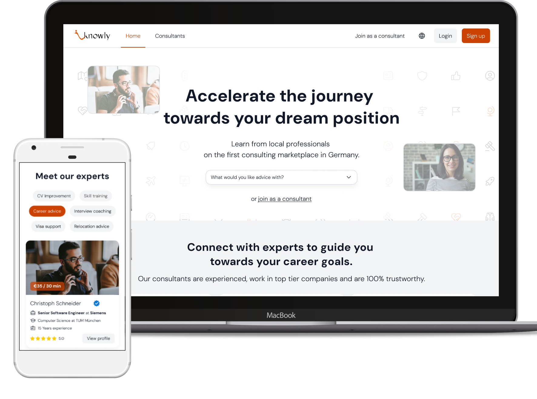
As a freelance UX/UI designer, I designed the website and web app for both user groups - end users and mentors - with a focus on a professional, modern look and responsive design for desktop, tablet and mobile.
In the first step in the project I conducted an analysis of the existing MVP from a usability perspective, using established heuristics. This gave the team initial starting points for improving the user experience and a neutral view of the status quo.
In a remote workshop, the project objectives were defined together with all key stakeholders, information on user groups and scenarios was gathered and initial preferences for the visual look and feel of the future platform were collected.
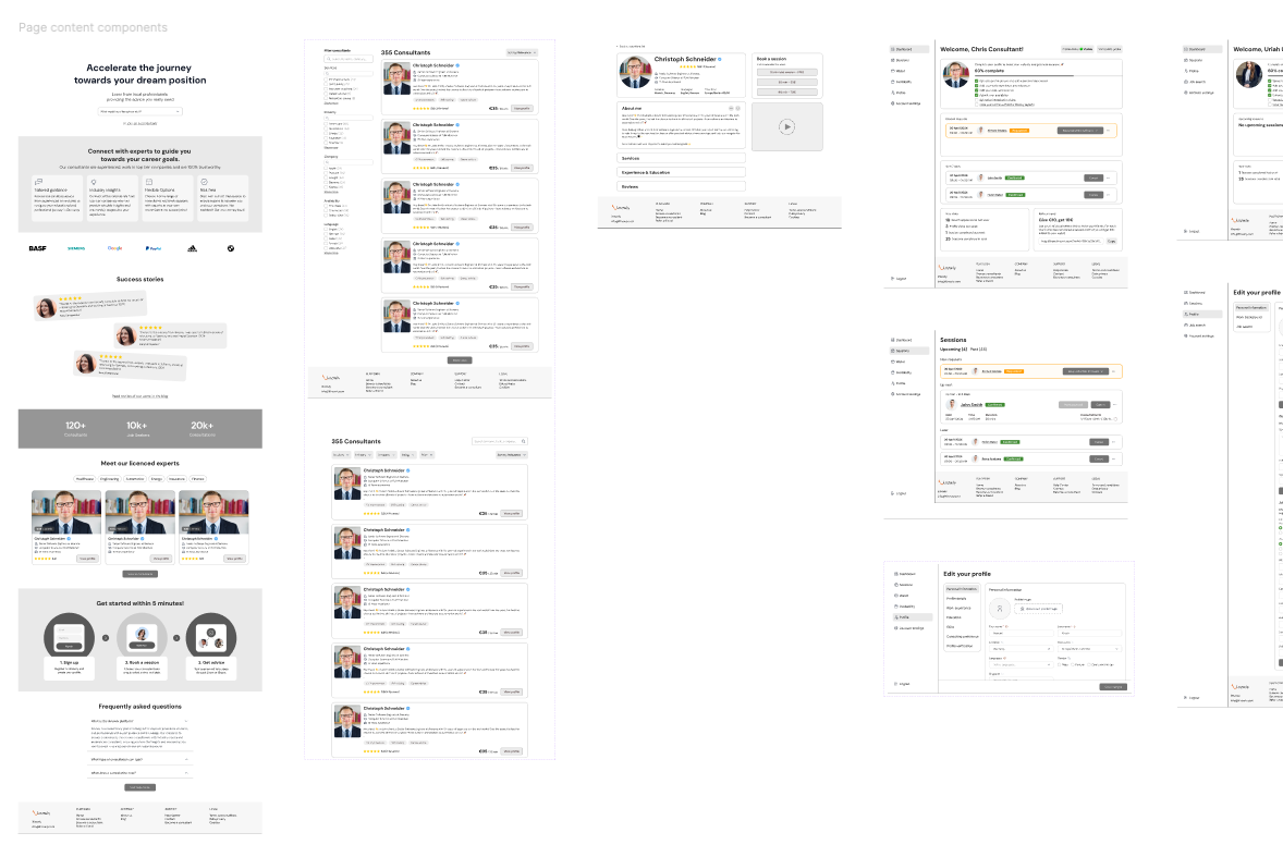
The basic information architecture, navigation concepts and page structures were defined in the form of low-fidelity wireframes. Basic layout behaviour for different end devices and screen sizes was also taken into account at this stage.
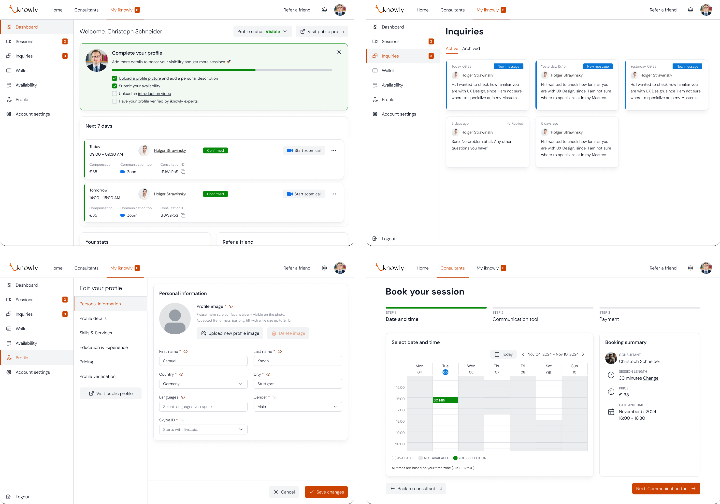
A particular focus was placed on addressing different user groups with their respective goals:
The goal of the new design language was to create a professional, inviting and modern look for the German market. One principle was to bring content to the fore - for this reason, colours were primarily used in photos or status elements.
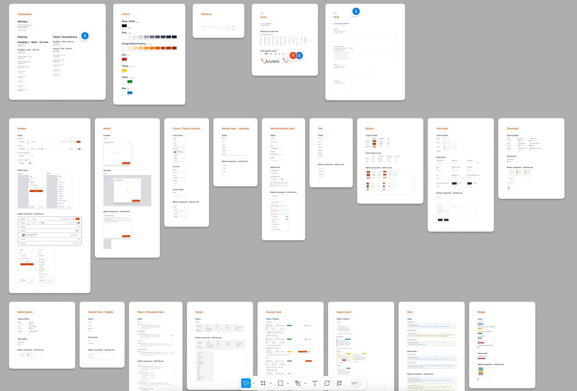
The responsive versions were also finalised in this phase to ensure an appealing presentation on all end devices. Colours, typography, styles and the individual components were documented in Figma for later development.
The design concept was validated in workshops with users of the various personas and usability weaknesses, suggestions for improvement and other requirements were identified. These and other validation rounds will help shape the future roadmap.